
Belgium’s national carrier, Brussels Airlines, has unveiled a new brand identity with updated colours, a new logo, and aircraft livery that provide a visual token of the airline’s “new chapter” – a chapter designed to create a “future-proof” airline with a strong focus on customer experience, reliability, and sustainability, while keeping a competitive cost-structure.
The new look is part of the airline’s 2020 “Reboot Plus” plan, also designed to re-emphasize on the importance of the Belgian brand, which was accelerated and intensified as a consequence of the COVID-19 crisis.
“We want to clearly mark the start of the new Brussels Airlines – for our customers, who deserve the best, but also for our employees, who are committed to the transformation that we’re pushing forward and to which they contribute every day,” said airline CEO Peter Gerber. “With this new brand identity, we are ready to show our customers, our employees, our partners, and all other stakeholders that we are turning a page.”
Gerber added, “As one of the four Lufthansa Group network airlines, we are building the way towards a promising future. We see this new brand identity as a symbol of confidence in our company, re-emphasizing our identity as Belgium’s home carrier.”
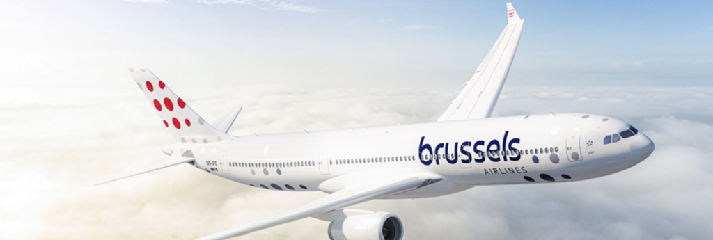
The new brand identity includes a new version of the Brussels Airlines signature red and blue colours, now a deeper red and a darker shade of blue. The dotted “b,” which today adorns the tails of its fleet, makes way for nine dots of different sizes in the form of a square, to represent the diversity of its customers, its destinations, and its employees. No dot is alike.
The updated logo also makes use of a new, more modern type font. The two words of the brand name are now stacked, with the word “brussels” gaining more importance with its larger size to emphasize the airline’s Belgian identity. The new aircraft livery shows a zoom on the dotted logo on the tails, a fresh white body and a continuation of dots in different shades of blue and grey.
Next to the new visual identity, the new brand identity also translates into a new tagline: “You’re in good company.”
“This new brand identity is a very logical step for Brussels Airlines,” said the airline’s head of marketing, Michel Moriaux. “After years marked by so many changes, it is important to clarify and confirm our position in the market. We are changing into a new company, with new cabin interiors, digitized processes, fleet renewal with A320neo’s on the way, and much more to come… We created a more contemporary branding, one that is fit for our digital age, one that represents a reliable and modern airline.”