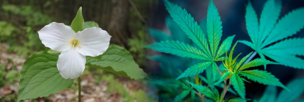
An organization dedicated to the modernization of traditional symbols and icons in Ontario have set their sights on the Trillium which was adopted by the Legislature as Ontario’s official flower in 1937.
The Organization for the Rejuvenation of Emblems in Ontario (OREO) says the Trillium is an outdated symbol which flowers for about a month in spring and is consequently seldom seen by the majority of Ontarians unless they spot it on their Driver’s Licences, Health Cards or other provincial documentation.
“To have a flower that blooms annually as a Provincial symbol is patently ridiculous,” said Beryl Amaranth, chair of OREO. “Ontario needs a robust flora to demonstrate the strength, potency and vigor of its people. It should ubiquitous. Its potency and staying power strong and accessible. You shouldn’t have to skulk about in the spring to find it. It’s even illegal to pick one.”
And OREO and Amaranth’s choice for Ontario’s provincial flower? Cannabis sativa. More commonly known as just plain cannabis, or marijuana, weed, dope, pot, grass, ganja, MaryJane just for starters.
Egon Smee, CEO of Flowersareourfriends.com, professed horror at OREO’s suggestion. “It’s a ludicrous idea. The White Trillium is gorgeous. It has three broad leaves, three small green sepals, three petals, and a three-sectioned seedpod. Even its genus name, trillium, refers to this phenomenon.”
“What’s more,” he added angrily, “she should get her facts straight – it is not illegal to pick a trillium. It is only illegal to remove them from government properties like provincial parks. Not that you should pick them – leave them as nature intended for everyone to enjoy.”
“Besides,” said Smee, “would you want a marijuana leaf on your licence or OHIP card? I certainly wouldn’t!”
“But many would,” scoffed Amaranth, “and you would be reminded of Ontario every time you passed a cannabis store or smoked a joint. All year round – not just a couple of weeks in spring. We’ve been canvassing MPPs– it’s a non-partisan issue. We have the votes.”
“We’ll fight it tooth and nail. We’ll picket Queen’s Park. This is just wrong, wrong, wrong.” Said Smee.
“It’s the right emblem for Ontario. It’s both strong and relaxed. It’s perfect. He’s just blowing smoke,” laughed the fictitious Amaranth, “and as it’s April 1st, I’m blowing smoke too.”
Happy April Fool’s Day readers. Here’s something true about Ontario’s Trillium logo we thought you might enjoy.
A stylized version of the trillium has been the Ontario government’s official logo since 1964, when it was first created by the Conservative government of John Robarts.
An updated version was designed by Ernst Barenscher at Norman B. Hathaway Associates in 1972, at the request of the Conservative government of Bill Davis.
 Over the next 24 years, the logo pretty much remained the same. Then, in 2006, the Liberal government of Dalton McGuinty completely revamped the logo.
The new logo quickly became known as the “three men in a hot tub” logo — once you see it, you can’t unsee it — and was widely criticized both for its design and cost.

In 2019, the Conservative government of Doug Ford restored the logo to its original design with some variations.

