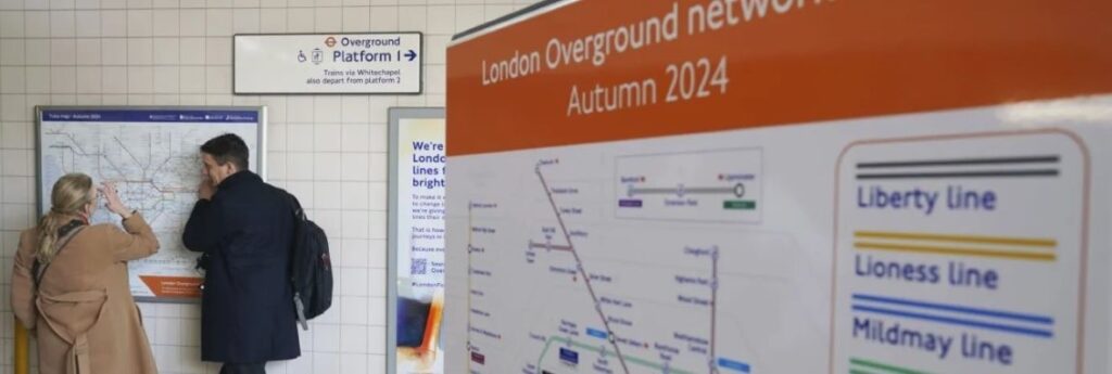
For anyone with even a passing acquaintance with London, the city’s Tube map is as iconic as the red buses or the black cabs. But for the past few years, there’s been something not quite right about the map originally designed by Harry Beck in 1933 – a collection of orange train lines, mostly orbiting the inner city, known as the London Overground.
They are like interlopers on the carefully crafted and easy-to-navigate map. And it’s been confusing for Londoners too.
Now, London Mayor Sadiq Khan hopes to bring some clarity to the suburban rail network that was established in 2007 through the effective merger of previous routes, and has grown to carry more than 3 million customers a week across more than 160 km of railway and 113 stations.
His solution, following widespread consultation, is simple — giving them names and new colours.
“Giving each of the Overground lines distinct colours and identities will make it simpler and easier for passengers to get around,” Khan says. “In re-imagining London’s tube map, we are also honouring and celebrating different parts of London’s unique local history and culture.”
The six names and colours will be:
- Lioness, which runs through Wembley Stadium in north London and honours the recent achievements of the England women’s soccer team. It will be shown as double yellow lines on the map.
- Mildmay, which honours a small charitable hospital in east London that played a crucial role caring for those with HIV/Aids in the early days of the illness in the 1980s. It will be shown as double blue lines on the map.
- Windrush, which commemorates the ship that landed near London in 1948, carrying more than 800 passengers from the Caribbean to new lives in Britain. A number of the stations on the line have historic Black communities, such as Peckham Rye and West Croydon. It will be shown as double red lines on the map.
- Weaver, which runs from the heart of the financial district in Liverpool Street to places such as Spitalfields, Bethnal Green and Hackney, where the textile trade blossomed. It will be shown with double maroon lines on the map.
- Suffragette, which celebrates the role of the working-class movement in the east of the city in the fight for women’s rights. The line runs to Barking, home of the longest surviving suffragette Annie Huggett, who died at the age of 103 in 1996. It will be shown with double green lines on the map.
- Liberty, which celebrates the eternal freedoms of the city and goes through Havering, which has historically had more self-governance than other parts of London. It will be shown with double grey lines on the map.
Transport for London expects the full rebranding to be completed by the end of the year. It will include an updated Tube map and station signs as well as the rerecording of public address announcements.
Last summer, the mayor’s office said the rebranding project had an estimated cost of 6.3 million pounds ($10.7 million), the bulk of which would be used to update customer information.
The Conservative opposition at City Hall said the changes were a “wasted opportunity” and that the mayor could have earned tens of millions of pounds by tendering the naming rights to commercial sponsors, as often occurs with sporting stadia, for example, with the money raised used to finance upgrades elsewhere in London’s transport system.
Mayor Khan said that was considered but that the “key thing was to make sure the lines have a link with the communities they are from.”
Last year, Transport for London changed the name of Bond Street tube station to Burberry Street for a week as part of a sponsorship deal, drawing widespread criticism. Detractors said the temporary name change, along with signage in blue instead of London underground red, caused confusion for visitors.


